Nekaroma

/ OVERVIEW
This branding project for Nekaroma, a vital part of the HPI Agro ecosystem, is centered around capturing the essence of nature through their exquisite essential oils.
The name NEKAROMA, stemming from "aneka" (variety) and "aroma," perfectly captures their commitment to delivering a wide range of enchanting scents. The logo features the company's initial "n" along with a leaf, symbolizing their connection to nature and the botanical foundation of their premium essential oils.
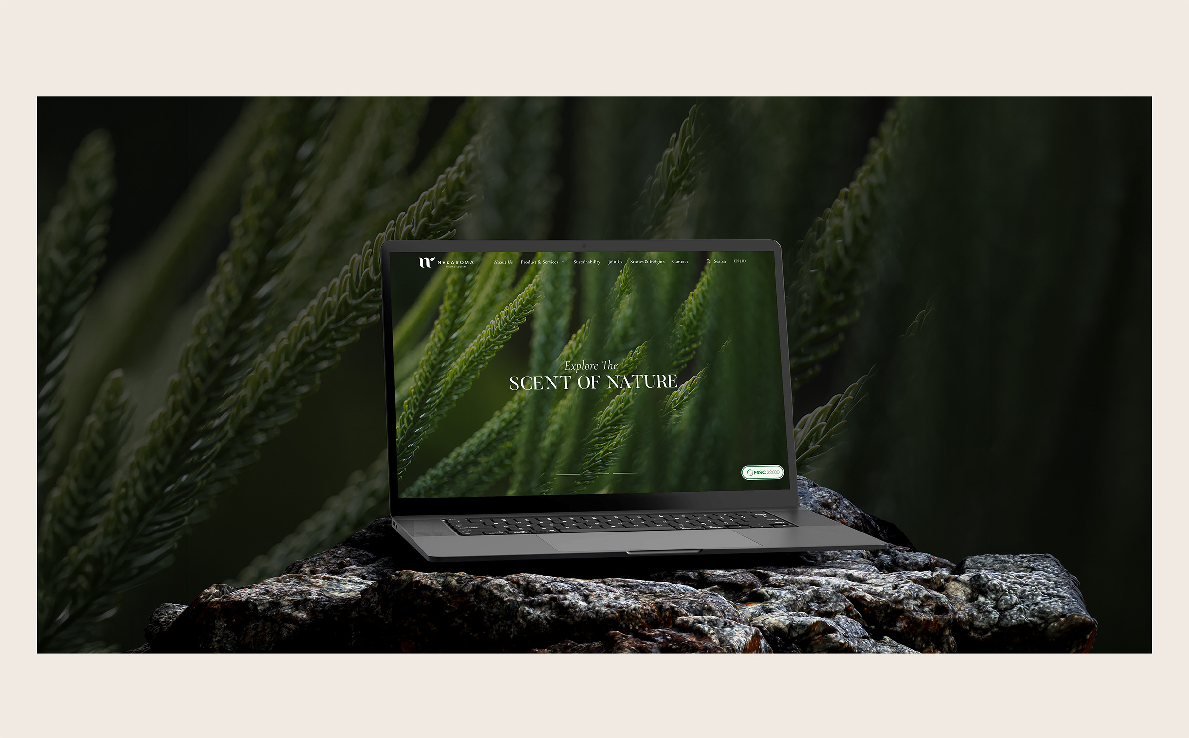
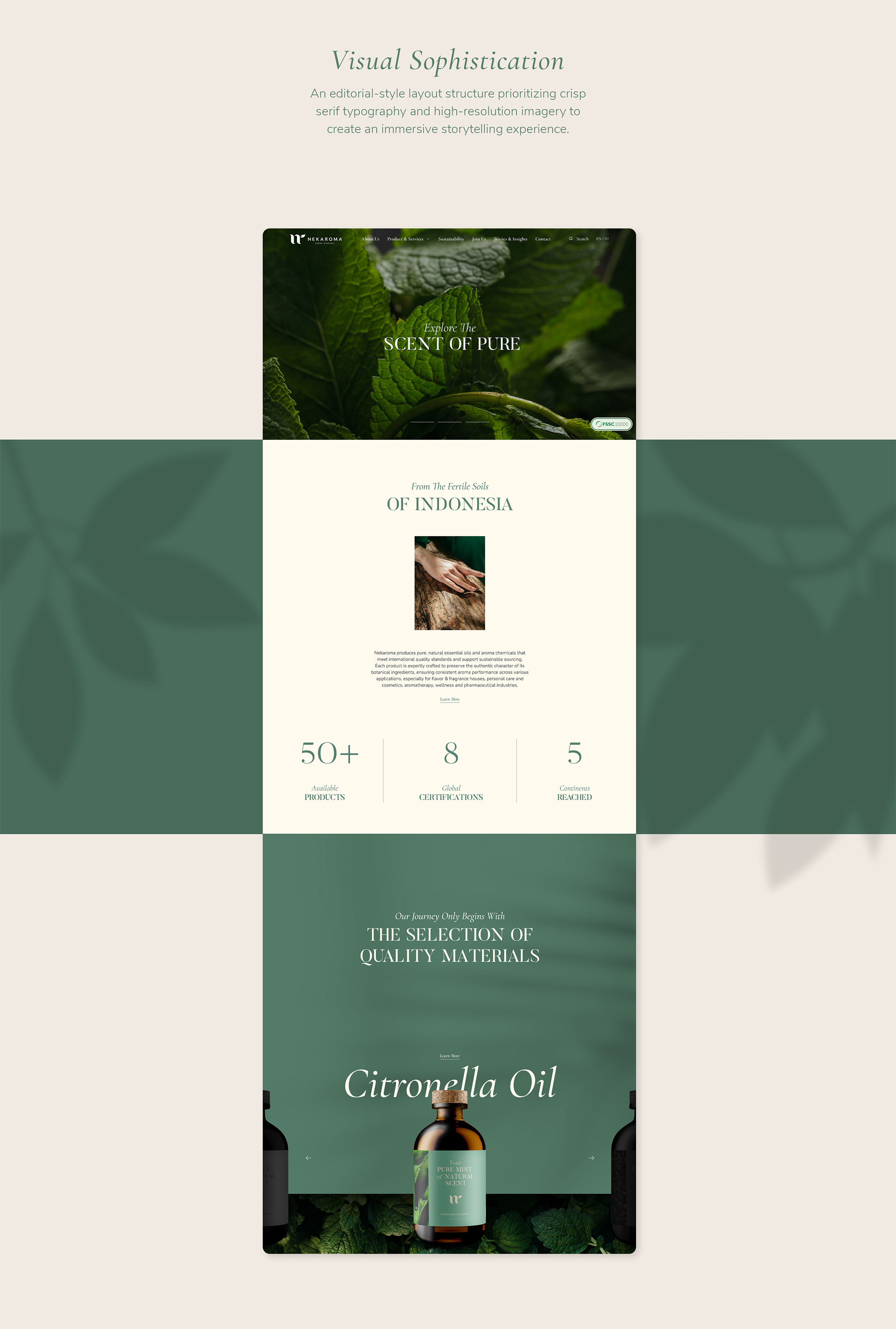
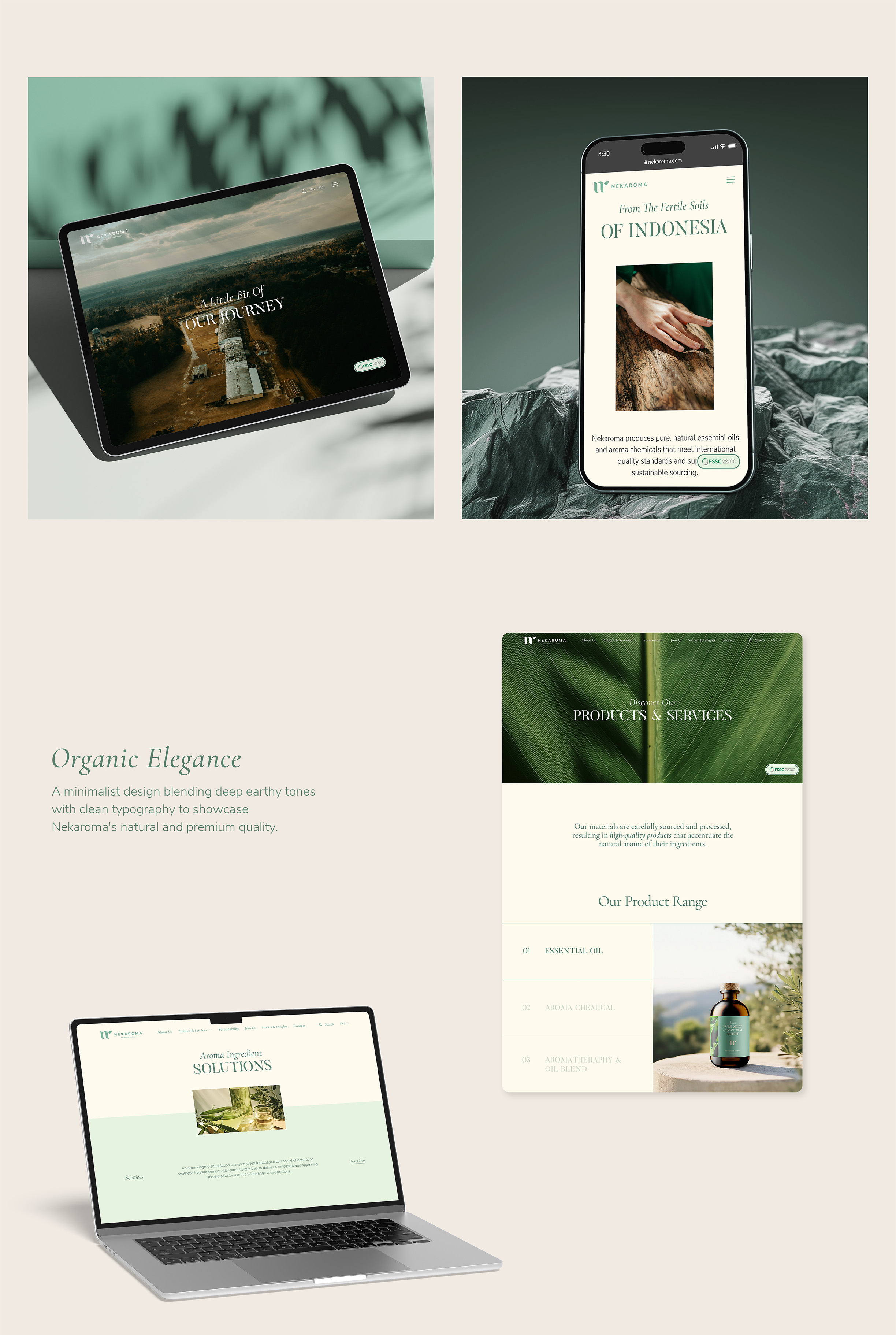
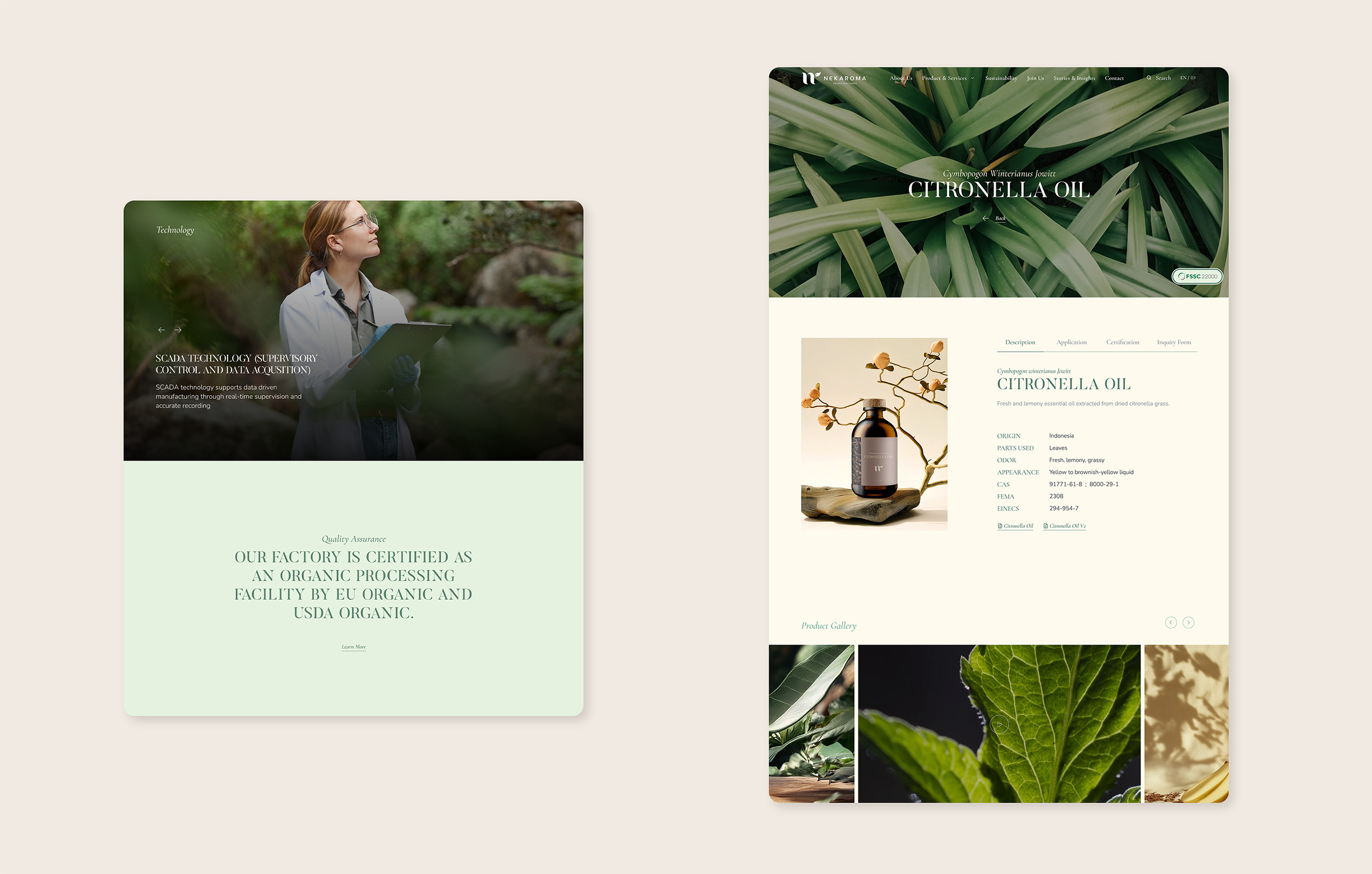
We extended Nekaroma’s natural and sophisticated identity into an immersive digital experience combining earthy tones, elegant typography, and rich imagery. The editorial-inspired layout creates a refined storytelling journey, allowing users to explore Nekaroma’s products, sustainability efforts, and connection to Indonesia’s natural resources.